There’s More Public Data Than People Exploring It
I recently built WattsOpen, an interactive site about where the US grid has room. It maps the large fossil plants retiring over the next several years, scores those sites on how close they are to existing transmission and gas lines, and digs into interconnection queues, retirement schedules, and the hour-by-hour fuel mix on each grid. Everything on it comes from open federal data, and I made the whole thing with Claude Code.
WattsOpen started as a way to test two theses I’ve had for a while. The first is that there’s a huge amount of data out there, structured and unstructured, that’s largely underexplored. People aren’t looking at it, and they’re mostly not trying to see how different datasets connect. FRED alone has over 800,000 economic time series. The EIA publishes monthly filings on every generator in the country. And honestly, this kind of exploration is one of the things AI is most useful for - understanding what a dataset is, writing the code to process it, figuring out how it relates to other data.
The second thesis is that these tools have gotten incredibly good at creating the right user experience for visualizing information. They can build something interactive that gets you to the signal quickly, and they can do it mostly automatically.
Why the Grid
I’ve been curious about how the grid fits into what’s happening in AI right now. Power keeps coming up as the bottleneck for data center construction, and when I started asking basic questions about it - what’s retiring, where does new generation connect, why does it take years - I realized I didn’t really understand anything about how the grid works. I didn’t know what an interconnection queue was or what a balancing authority does.
I could have read explainers, but I learn better by building. The plan was to pull the real data, work through it with Claude Code, and end up with something I could keep using and updating as I learn more. The site is as much a tool for my own learning as it is something to share.
What WattsOpen Is
The site tells five short stories on top of the same data:
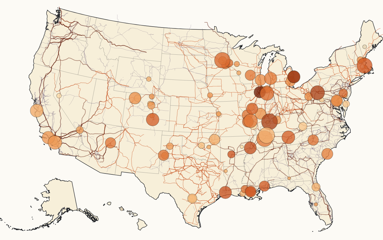
- A co-location atlas - every US fossil plant of 100 MW or more retiring between 2024 and 2030, scored on distance to high-voltage transmission, distance to interstate gas, site size, and recent utilization. These are sites where grid infrastructure is already in place and about to be freed up.
- A retirement schedule - a county-by-county map of the roughly 73 GW of fossil capacity scheduled to retire through 2035.
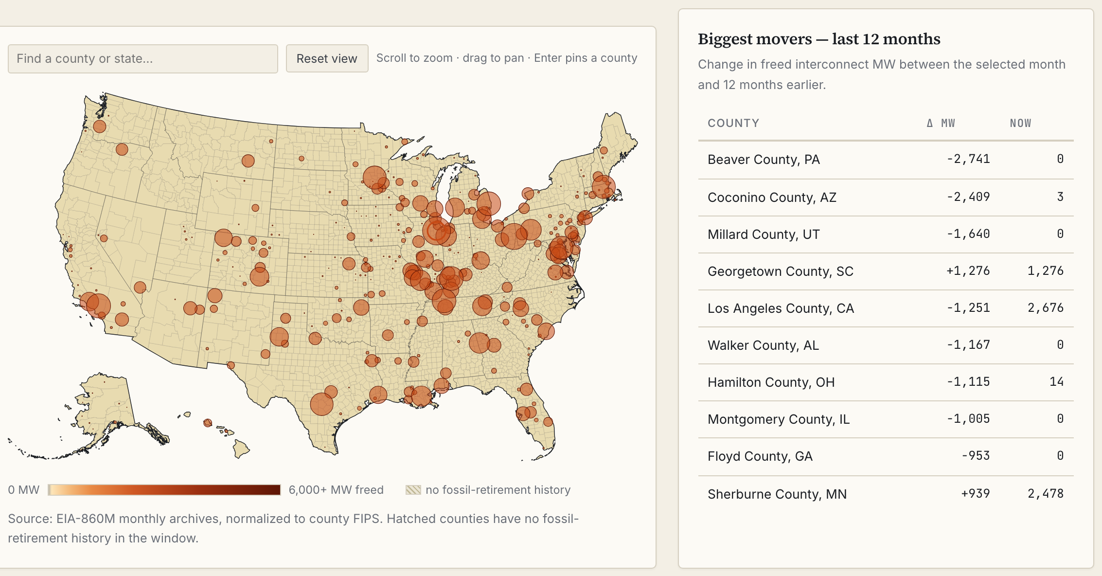
- A headroom time machine - a replay of ten years of monthly EIA-860M filings, showing when retirement plans first appeared in the public record, county by county.
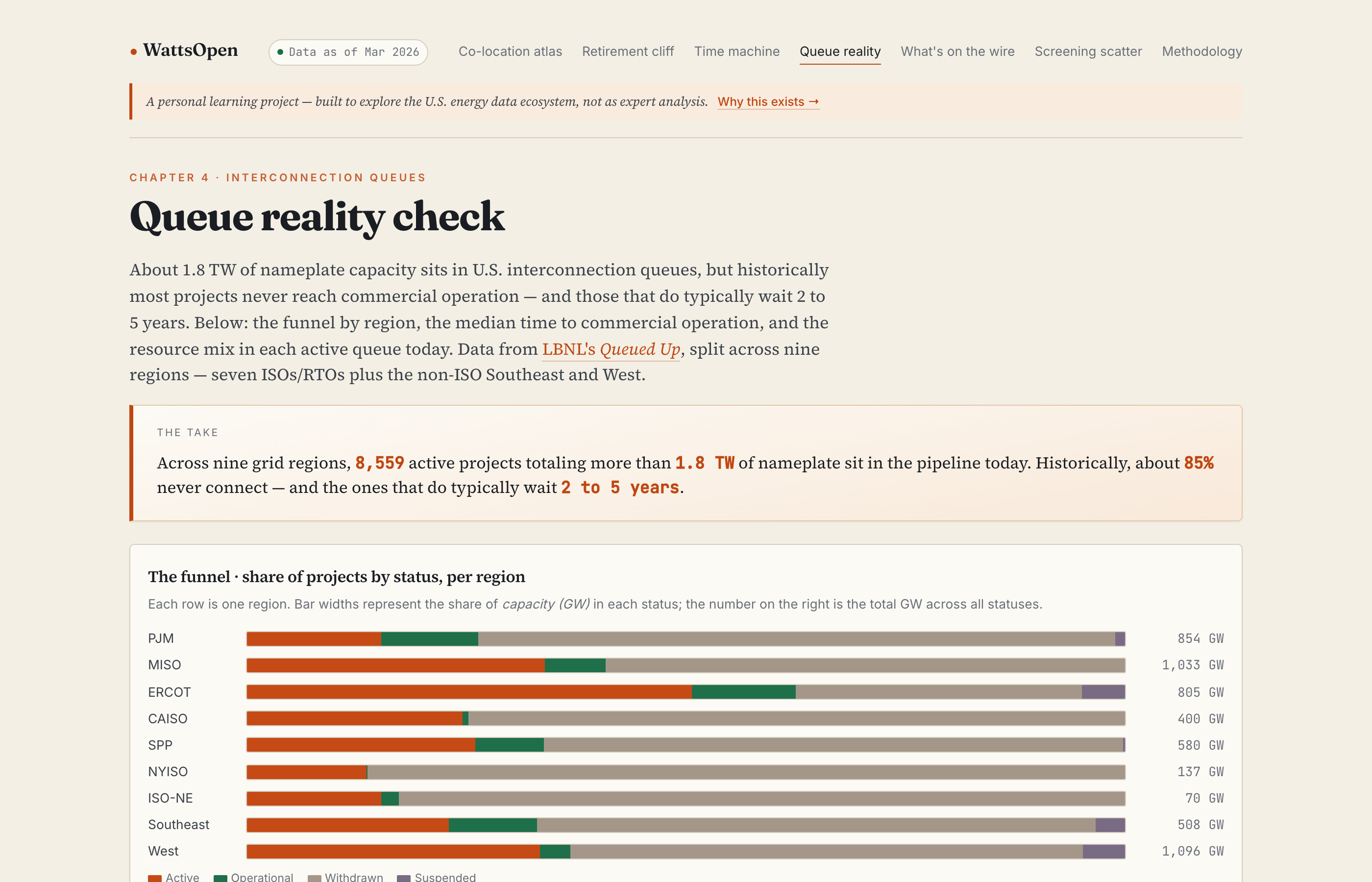
- A queue reality check - withdrawal rates, time-to-operation, and resource mix for the interconnection queues in nine regions, built on LBNL’s Queued Up data.
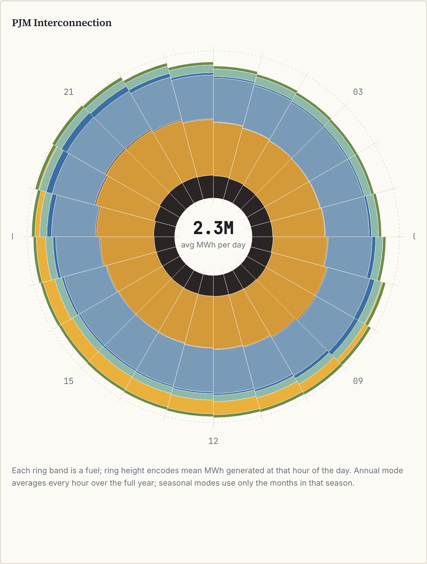
- An hourly fuel-mix clock - what’s on the wire hour by hour across nine balancing authorities, from EIA-930 data.
The sources are EIA generator and utility filings, hourly grid data from EIA-930, LBNL’s queue research, and HIFLD’s maps of transmission lines and gas pipelines. All of it is free, though for most of the sources I had to sign up for an API key.
How I Worked
The first commit was May 16. The site was live about two and a half weeks later - 33 commits across nine days of touching the project, all in spare time.
Claude Code was the thought partner for the whole thing. I used it to understand what the datasets actually are, to build the code that processes them, to figure out how they relate to each other, and to build the visualizations. Before processing a dataset I’d have it explain what I was looking at - who files EIA-860M and why, what “nameplate capacity” means, how LBNL assembles queue data from nine regions that each define project status differently. Then it wrote the pipeline (fetch each source, normalize to Parquet, load into DuckDB, export JSON for the site) and built the site itself in static HTML and D3 with no build step.
The loop was the same every session. Ask what datasets exist for a question I had, fetch one, have Claude explain the columns and how the data gets collected, look at it together, then figure out how it could join to what we already had. The most useful results came from the joins - retirement filings matched to transmission line locations tell you something neither dataset does on its own.
What I Learned
My mental model of this space is still crude, but a few things stuck:
- About 1.8 TW of nameplate capacity sits in US interconnection queues, which is more than the entire installed generating fleet. Historically most of it never gets built. Across the projects in the data, about 85% never reach commercial operation, and the ones that do typically wait two to five years.
- Meanwhile, fossil plants retire on a published schedule, at sites that are already wired. The median retiring plant in the atlas is a quarter mile from a high-voltage substation and about five miles from an interstate gas pipeline.
- The fuel mix on each grid changes hour by hour. Solar pushes gas off the grid at noon in some markets while coal runs flat through the day in others - patterns that annual averages smooth over.
None of this is news to anyone in the industry, but it was all news to me, and working through the data myself made it stick in a way that reading about it wouldn’t have.
What This Isn’t
I’m sure I got a ton of things wrong here. If you’re an expert in this space, you’ll probably look at WattsOpen and see a naive view of how the grid works, and maybe some things that make no sense at all. Every page on the site has a banner saying it’s a personal learning project, not expert analysis, and I mean that. There’s no parcel-level analysis, no per-RTO transfer rules, and the queue data is an annual snapshot with status definitions that vary by region. None of that made it less useful as a way to dig into the space and learn. Just don’t use it to make siting decisions.
Final Thoughts
The grid was the subject here, but the thing I’m most enthused about is the workflow: exploring data in an applied fashion to learn a domain, and ending up with something I can keep using to learn more. The same approach would work on macro series from FRED, SEC filings, court records, FDA databases - any field with a pile of public data behind it. I wrote a few months ago about domain experts being the biggest AI opportunity. This project was sort of the inverse. I had no expertise, and the tools still got me to something I learned a lot from and that might be useful to other people. Someone who knows energy cold could skip the tutorial phase and go a lot further.
If you know this space, I’d like to hear what WattsOpen gets wrong - that’s part of the learning. And I’m curious whether others are doing this kind of applied exploration with public data in their own fields.