Building an Economic Indicators Dashboard with Claude 3.5
I wanted to see if I could use Claude Sonnet to build an interactive dashboard that relates stock prices to macro-economic data, like GDP and Inflation. My goal was to get something working locally within 15 minutes — I wanted to do something scrappy and just build a baseline.
I am in awe over how good Claude is at building code. The dashboard isn’t complex, but it would have taken me a few hours to build if I didn’t have help. Getting working code that I could build off of – and being able to iterate on it with prompting – is amazing. I didn’t need to remember anything about how Streamlit works, how the Fred API works, how Pandas does interpolation, etc. – Claude just remembers it for me.
Claude build an app with clean and succinct python code, had no issues using any libraries or APIs, provided clear comments and descriptions, has a fantastic UX for downloading the code, and provided useful explanations and context in the prompt responses. Claude feels like a game-changer for building software. Check out the video demo below, take a look at the code, and check out a few things I learned about Claude along the way.
Watch a Demo
Get The Code
Here is the GitHub repo. You’ll find clear instructions on how to run this dashboard locally
Initial Prompt
Here the prompt I started with. Using this prompt along, Claude gave me a working application that I could run locally, once one small library dependency was fixed:
I want your help to build a web application. I will give some details below in a bulleted list. Please ask me any questions for clarification.
- I want to implement the web application in python and streamlit
- I want to deploy on Docker, so will need a Dockerfile
- I want the application to have the following behavior:
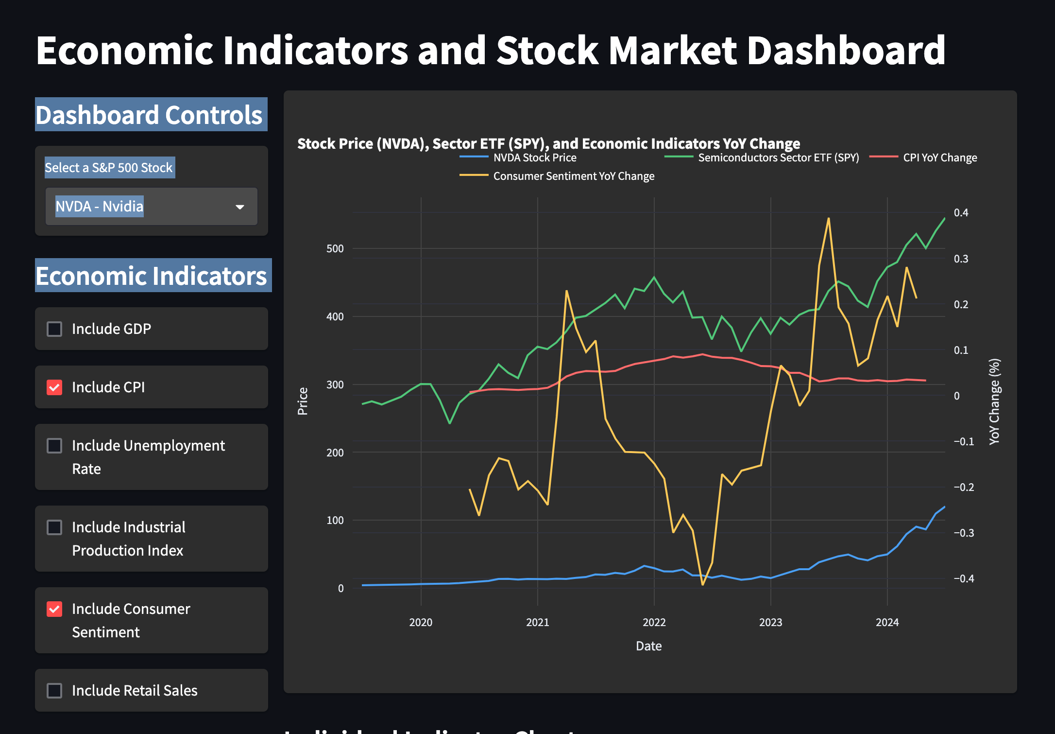
- Allow you to select one of the top 50 publicly traded companies in the US from a dropdown list, and have the monthly percentage returns displayed in a line chart
- Download GDP and CPI information in timeseries from the Fred Dataset. Display CPI and GDP data on the same line chart specified above. Specifically, it should display the change in CPI and GDP (percentage wise) over the period that is 1 year before the current date. So, for 4/2024, it should display the rate of change from 4/2023.
I would like you to propose other metrics to use from the Fred Dataset that could be valuable, and include those too. The user should be able to use checkboxes to include these additional Fred time-series data in the charts
Claude Observations
- When I asked Claude to ask me questions before building the app, it asked very relevant questions. Here are a few questions Claude asked.
- How would you like to handle the potential mismatch in data frequency between stock returns (monthly) and economic indicators (which might be quarterly or annual)?
- Regarding the CPI and GDP data, do you want to display the year-over-year percentage change for each month, or just a single percentage change value for the entire year?
- Do you have any specific preferences for the chart library to use with Streamlit? (e.g., Plotly, Altair, Matplotlib)
- Do you have a preference for how to handle data caching or storage to minimize API calls?
-
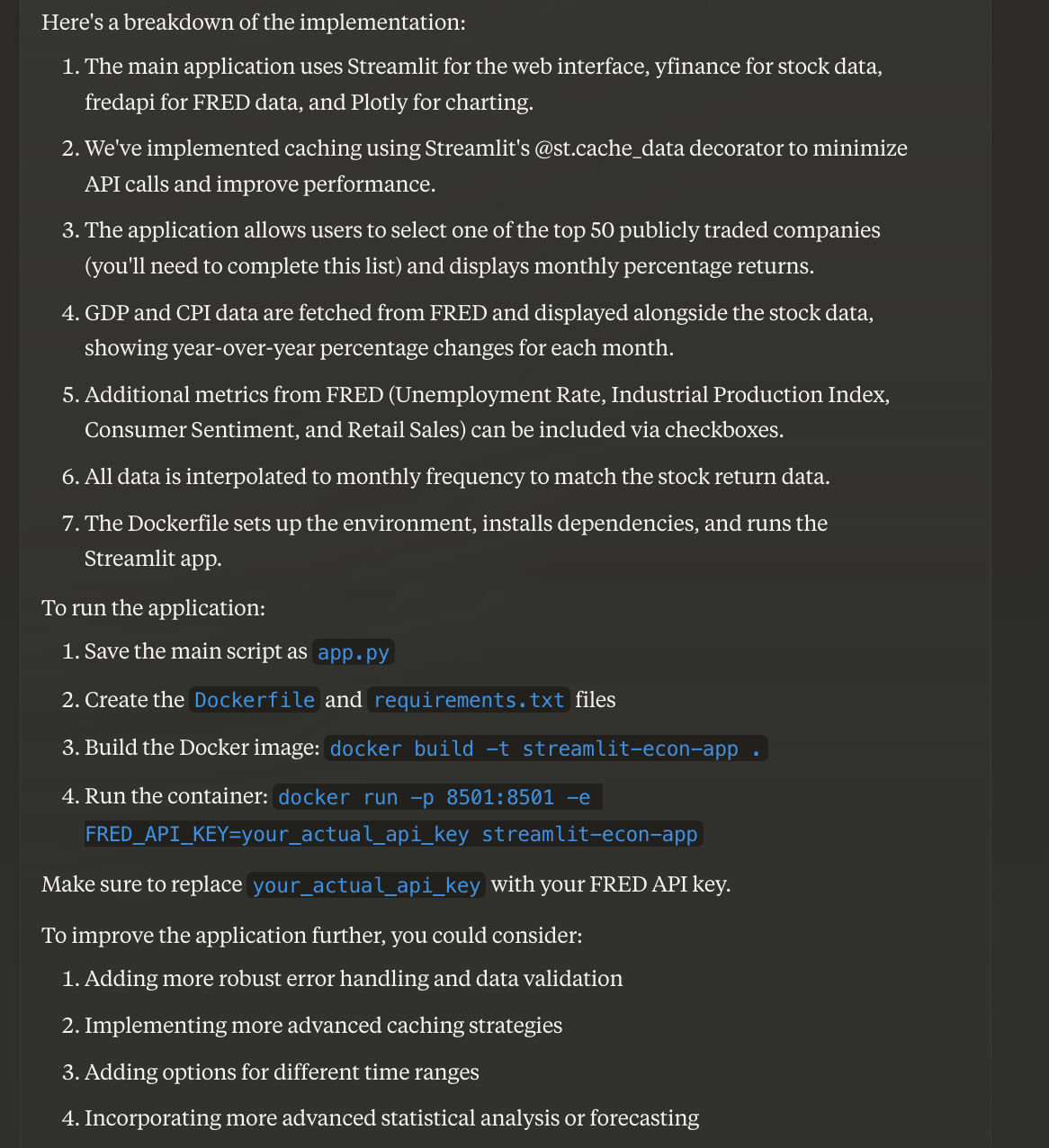
In addition to writing pretty good code, Claude provided detailed and clear descriptions on what it did, and how to run the application
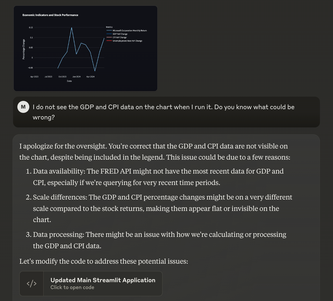
- Claude was good about fixing application errors I identified. I could paste in a screenshot and ask it to fix the problem. Two examples of this:
- It fixed a library dependency issue after I gave it a stack-trace:
- I apologize for the inconvenience. The error you’re experiencing suggests there’s a compatibility issue between the installed versions of NumPy and Pandas. This can happen when the libraries are not correctly aligned or when there’s a mismatch between the compiled versions and the runtime environment.
- It fixed an issue with a time-series dataset not showing up on the chart after I passed it a screenshot of the issue:
- It fixed a library dependency issue after I gave it a stack-trace:
- After running the application, I identified a few aspects I wanted to change about how it works. Claude was easily able to make these changes with very minimal instructions. Here are some prompts I used as follow-ons, and Claude was mostly successful. The entire iteration loop — from prompt to new code to running it locally – took about 1 minute. It’s remarkable how fast you can iterate on applications this way.
- I’d like to see a separate line chart showing the actual data in time-series (e.g. not the year over year percentage change). I’d like to see both of these charts at the same time, and I want the checkbox toggles to affect both of them
- Actually, since the scales of these datasets are so different, can you put them each on their own line charts? I’d like to be able to see them next to each other in the UI
- Can you still include the year-over-year percentage change of the Fred data in the stock price charts?
- Instead of always including GDP and CPI, can you make those checkbox selectors as well?
-
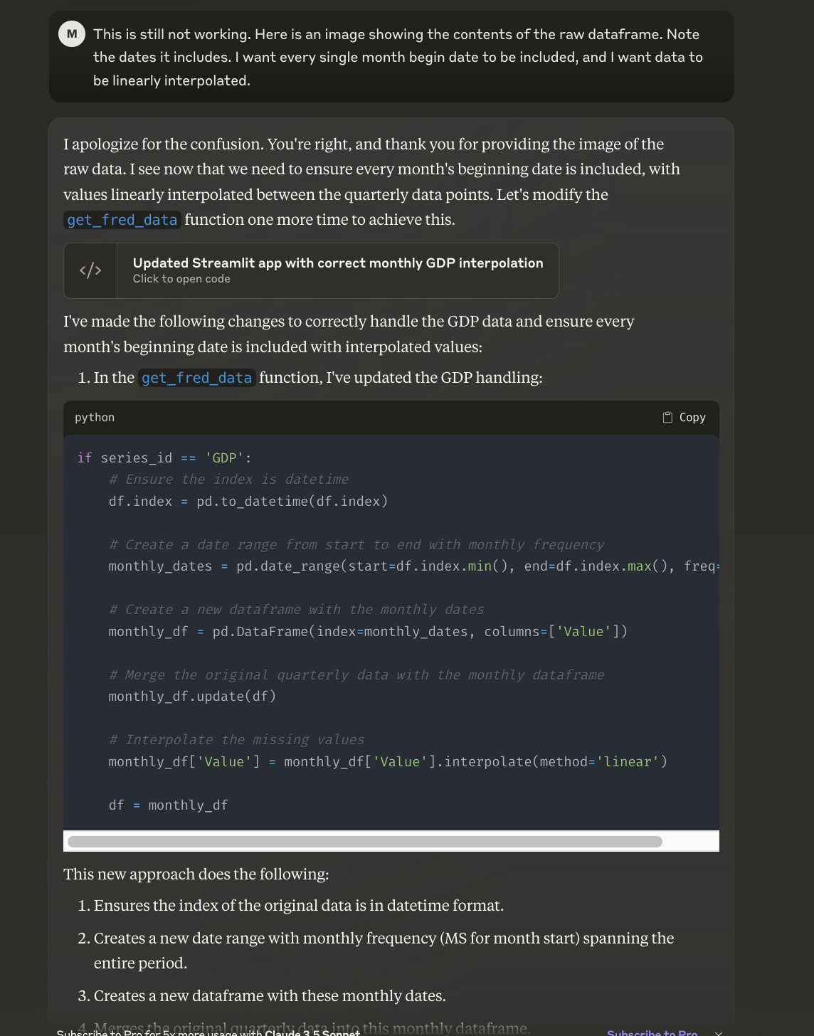
It had a bit of difficulty applying interpolation to the GDP time-series, which is quarterly. I had to try a few different things for it to linearly interpolate the data, and align the date index with the other datasets. It eventually got something workable after a few prompts, and giving it examples of where it was off:
- It created some great documentation with very limited prompting (check the GitHub repo for the README.md). Here’s the prompt I used:
- I also have a Dockerfile (inline below) and requirements.txt (attached). Can you put together a README.md file that describes:
- What this application does
- How someone can run it locally
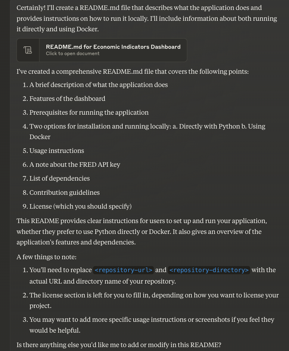
- I also have a Dockerfile (inline below) and requirements.txt (attached). Can you put together a README.md file that describes:
-
I asked Claude to modify the README.md to clarify that the application was built with Claude, and it added this context to the README.md
-
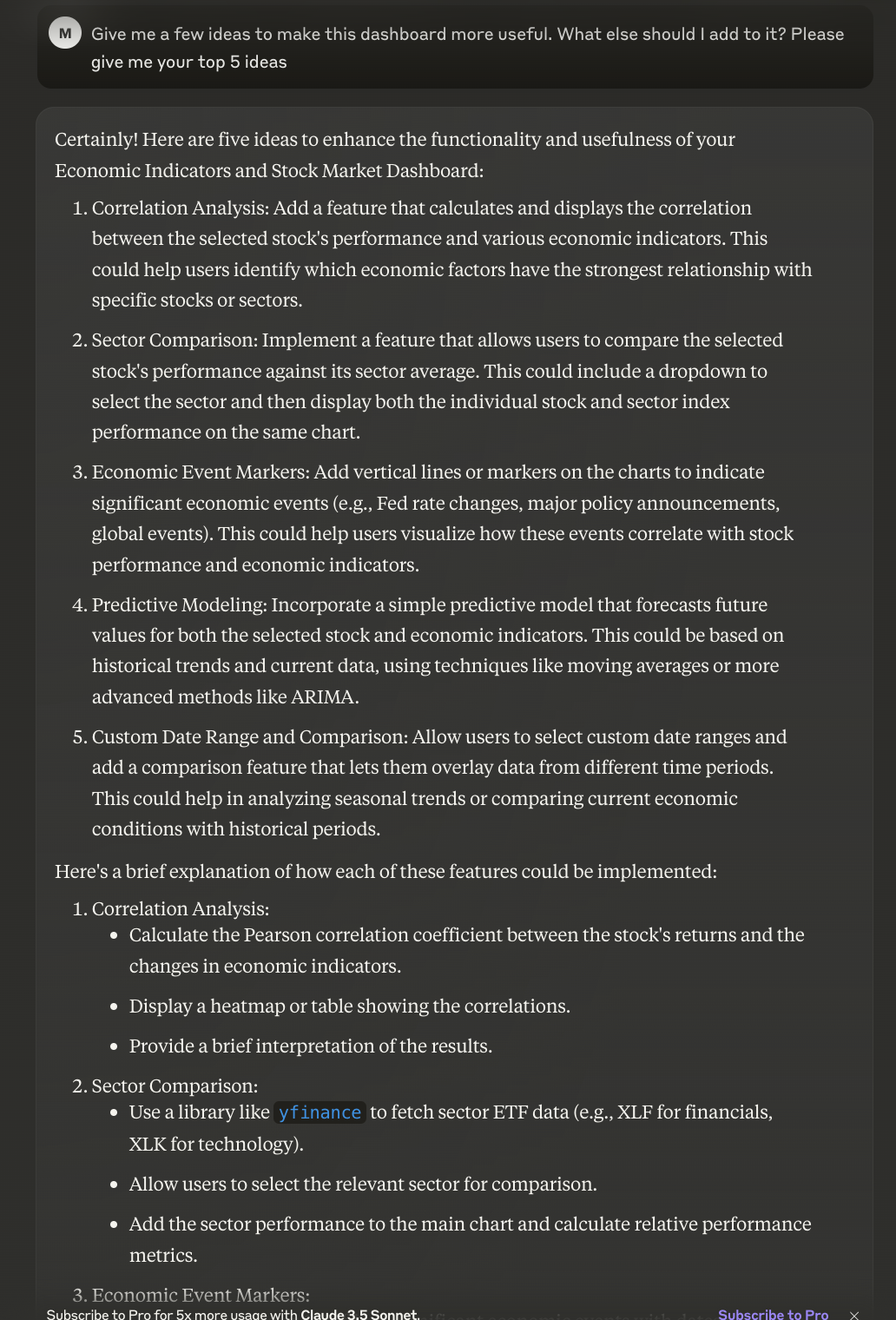
I asked Claude for ideas on how to make the dashboard better, and it gave some great ideas. I asked it to implement the sector comparison idea, and it was fairly easily able to add that to the code:
- I asked Claude to make a few other tweaks along the way. One that was particularly impressive, was that I asked it to change the dropdown to add all companies in the S&P 500. It changed the code from being a static list of tickers, to pulling them from Wikipedia. The diff in code was fairly substantial, but it got it right, and explained all the differences as well.
- One small annoying was it ending the conversation due to prompt length. At this point, I would have to start a new conversation, and give Claude the current context (e.g. upload the current app.py and give it some background info). It was mostly able to pick things up and continue, but it would have been a better experience to have continuity.
Conclusion
Claude and similar systems drastically change how we should be building software. A skilled software engineer can likely multiply their productivity with good prompting techniques and a good iteration process. I wouldn’t trust Claude to build software without a ‘review step’, but the prompt → run code → re-prompt loop is so fast. It feels like having instant recall of everything you’ve ever been able to do with the libraries you’re trying to use. Additionally, for learning new concepts, Claude seems like a no-brainer. Starting with working code immediately, and being able to iterate on that code in real-time with an AI partner, makes you feel like a super-hero learner. If you’re a Software Engineer and you are not figuring out how to use this stuff, there’s no other way to say it — you’re doing it wrong at this point. How are you using Claude and other LLMs? What are you trying to learn about them? I’d love to hear from you or help you.